Letterforms That Built the Screen: The Eastern European Typographers Behind the Fonts You Read Every Day
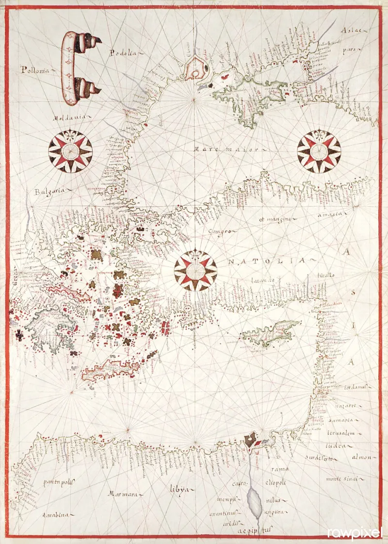
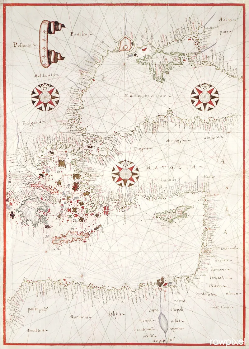
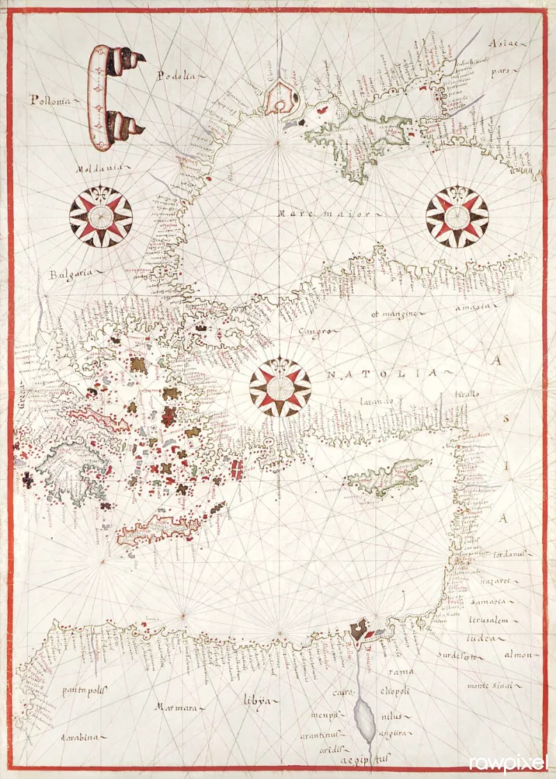
Photo: Rawpixel Ltd, CC BY 2.0, via Wikimedia Commons
When American students enroll in typography or user interface design courses, the canonical lineage they receive tends to follow a familiar arc: Gutenberg, Garamond, the Bauhaus, Helvetica, and eventually the clean sans-serifs that populate Silicon Valley's product decks. What that narrative omits, with remarkable consistency, is a parallel tradition stretching from Prague to Kyiv to Warsaw—a tradition of letterform innovation that did not merely influence the digital age but, in several measurable respects, constructed its foundational scaffolding.
The invisibility of Eastern European typography in American design history is not accidental. It is the compound product of Cold War information barriers, the collapse of institutional memory after 1989, and a persistent Western tendency to treat the region as a consumer rather than a producer of modernity. Correcting that record requires more than honorable mention in a footnote. It demands a fundamental reassessment of where the digital reading experience actually came from.
The Bauhaus Detour and What It Missed
Most design historians acknowledge that the Bauhaus, the celebrated German school shuttered by the Nazis in 1933, cast a long shadow over twentieth-century visual culture. What those same histories rarely emphasize is how many of the school's most radical typographic ideas were developed in dialogue with, or in direct response to, avant-garde movements originating in Eastern Europe. Russian Constructivism, Polish Constructivism, and the Czech avant-garde of the interwar period were not derivative of the Bauhaus—they were its intellectual contemporaries, and in several cases its predecessors.
El Lissitzky's typographic experiments in the early 1920s, for instance, proposed a relationship between letterform and spatial organization that anticipated computational layout logic by half a century. His insistence that type should function as a visual architecture—not merely a vehicle for phonetic information—prefigured the grid-based systems that would later govern everything from newspaper layout software to responsive web design frameworks. Yet when American universities teach the history of information design, Lissitzky appears, if at all, as an artistic curiosity rather than a technical ancestor.
The Cold War Type Laboratory
The mid-twentieth century created an unusual condition for Eastern European typographers working within Soviet-bloc countries: extraordinary technical constraint combined with genuine institutional support for letterform research. State printing enterprises in Czechoslovakia, Poland, and Hungary employed professional type designers whose work, though ideologically supervised, was often technically sophisticated and formally inventive.
Oldřich Menhart, the Czech type designer whose roman and Cyrillic typefaces were developed across decades of political upheaval, produced letterforms of remarkable structural integrity that influenced subsequent font engineers far beyond his own country's borders. His approach to the relationship between stroke weight and negative space anticipated concerns that would become central to screen legibility research in the 1990s, when font engineers working on early operating systems struggled to render readable text at low pixel densities.
In Poland, the Warsaw-based typographer Andrzej Heidrich—better known domestically for his banknote designs—contributed to a tradition of precision letterform construction that informed how Polish designers later approached digital font development during the country's post-1989 technological opening. The transition from communist-era state typography to participation in the global digital font economy was neither smooth nor well-documented, but it produced practitioners whose technical fluency was, by any measure, exceptional.
Unicode, Encoding, and the Cyrillic Problem
The development of Unicode—the computing industry's universal character encoding standard, without which multilingual digital communication would be effectively impossible—required the systematic cataloguing and technical specification of scripts from across the world. For Eastern European languages using Cyrillic alphabets, this process was neither straightforward nor politically neutral.
The engineers and linguists who advocated for comprehensive Cyrillic representation within early Unicode committees were, in many cases, working against institutional inertia in an industry that had been built around Latin-script assumptions. The technical challenges were genuine: Cyrillic letterforms share visual similarities with Latin characters while encoding entirely different phonetic values, creating potential for rendering errors that could corrupt meaning. Resolving those conflicts required deep expertise in both typographic history and computational encoding logic.
Ukrainian, Bulgarian, Serbian, and Macedonian Cyrillic variants each carry distinct letterform traditions that demanded individual technical attention. The scholars and type engineers—many of them working from Eastern Europe or from Eastern European diaspora communities in the United States—who navigated those specifications contributed foundational work to the infrastructure that now supports Cyrillic text rendering across every major operating system and web browser. Their names do not appear in the design history textbooks used at American universities.
Accessibility and the Legibility Inheritance
Contemporary digital accessibility standards—the guidelines that govern how text must be rendered to remain readable for users with visual impairments or cognitive differences—draw heavily on legibility research conducted across the twentieth century. Much of that research, particularly work on stroke contrast, x-height ratios, and inter-character spacing, was advanced by Eastern European typographers working in academic and state-sponsored research contexts where legibility had practical urgency: mass literacy campaigns, public signage systems, and official document production all demanded type that functioned reliably across variable printing and reading conditions.
The Web Content Accessibility Guidelines, which American institutions are legally required to follow under the Americans with Disabilities Act's digital provisions, encode assumptions about letterform contrast and size that trace their intellectual lineage in part to that mid-century Eastern European research tradition. That lineage is not cited in the guidelines themselves, nor in the design documentation that American developers consult when building accessible interfaces.
What American Design Schools Are Missing
The practical consequence of this historiographic gap is that American design students are building digital products on a foundation they do not fully understand. When a UX designer at a technology company in San Francisco makes decisions about typeface selection, line spacing, or character encoding for a multilingual application, they are working within a set of constraints and conventions that Eastern European practitioners helped to define. Without that historical context, those decisions are made by intuition or convention rather than by informed understanding.
Several American universities with strong Eastern European studies programs—institutions that maintain dedicated Slavic studies departments and archival collections—are well-positioned to address this gap. Collaborative curricula that bridge design history and area studies could introduce students to the full breadth of typographic innovation that shaped their professional tools. The scholarly resources exist; what has been lacking is the institutional will to connect them to design education.
Recovering the Record
Digitization projects currently underway at archives in Prague, Warsaw, Lviv, and Vilnius are making primary materials—specimen books, correspondence between type designers, technical manuals from state printing enterprises—newly accessible to researchers outside the region. For American scholars working at the intersection of design history, Slavic studies, and the history of computing, these archives represent a significant and largely unexplored resource.
The history of how we read on screens is not a story that began in California in the 1980s. It is a story with deep roots in Eastern European intellectual and material culture—roots that, once traced, reveal a tradition of letterform thinking as rigorous, as inventive, and as consequential as any celebrated in the standard Western canon. Acknowledging that tradition is not merely an act of historical justice. It is a precondition for understanding the designed world we actually inhabit.